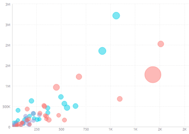
The Scatter Chart displays the distribution of two variables on an X-Axis, Y-Axis, and two additional dimensions of data that are shown as colored circles scattered across the chart:
-
Point: A field that for each of its members a scatter point is drawn.
-
Size: An optional field represented by the size of the circles. If omitted, all scatter points are equal in size. If used, the circle size is relative to their value.
Adding Data
1. In the X-Axis panel, click Add + to select the field whose values will be placed on the X-Axis.
Typically, the X-Axis of a Scatter Chart is used to represent numeric data. Alternatively, Descriptive data is also supported. You can only add one field.
2. In the Y-Axis panel, click Add + to select the field whose values will be placed on the Y-Axis.
Typically, the Y‑Axis of a Scatter Chart is used to represent numeric data. Alternatively, descriptive data is also supported. You can only add one field.
Note: The maximum amount of data points is 500.
3. In the Point panel, click Add + to select the point field.
The point area determines the field to be scattered across the chart as circles; one point (circle) appears on the chart for each member of this field. These fields must be descriptive data (not numeric data).
You can only add a point if either the X-Axis or the Y-Axis was defined to represent numeric data.
4. In order to group points of descriptive data, select a field by which to break (group) the fields in the chart. If you select descriptive data, then the points in the chart are grouped into the members of the field. Each member is represented by a different colour.
In order to group points of numeric data, select a field by which to colour the fields in the chart. If you select numeric data, then the point color is a gradient where the highest value is the darkest color and the lowest value is the lightest color.
5. In the Size panel, select the field that determines the size of the circle. It must be numeric data.
Designing the Scatter Chart
Fine-tune the appearance of the scatter chart widget using the following tools.
- Legend: Specify whether to show or hide the Legend, and select its position.
- Marker Size: Change the size of the circles. If you are not using a Point value, the slider will change the size of all the points on the map. If you are using the Point value, drag each side of the slider to determine the relative minimum and maximum circle sizes.
- Value Labels: Specify whether to show or hide labels indicating the values of each point (circle). Select the orientation of these labels: Horizontal: (Default), Diagonal or Vertical.
- X-Axis and Y-Axis:
- Grid Lines: Shows (Default) / hides.
- Logarithmic: Displays using orders of magnitude.
- Labels: Shows (Default) / hides.
- Title: Select the checkbox to display the axis title. To edit the title, type in a new title. Click outside the text box to apply the new value. To change the default minimum, maximum or interval values on the axis, type in the new values, and click outside the text boxes to apply the new values.
- Values on Axis: To restore any of the values to their default states, click on the reset button.

Note: Minimum and Maximum values cannot be customized.