The Pie chart is used to display proportional data, and/or percentages.
Adding Data
-
In the Categories panel, click Add + to select the data that will be displayed in the Pie Chart. You can add only one field.
Typically, the categories of a Pie Chart contain descriptive data
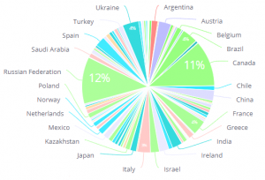
Note: All slices that are smaller or equal to 3% are grouped together into a slice called Other. You can hover over this slice to display its breakdown.
2. In the Values area, select the field whose values determine the size of the pie slice by clicking Add +. Values are typically used to represent numeric data.
Designing the Pie Chart
Fine-tune the appearance of the Pie Chart widget, using the following tools:
-
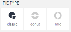
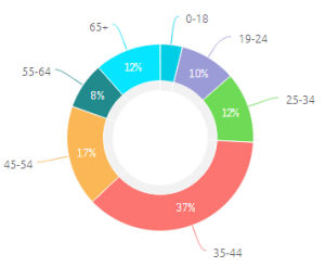
PIE TYPE : Select how the pie appears.
-
Legend: Specify whether to show or hide the Legend, and select its position.
-
To add a title to the legend, so that users understand clearly which dimension is displayed in the chart, add the following code snippet on the widget level:
-


args.options.legend.title = [];
args.options.legend.title.text = "Some text";
args.options.legend.title.style = [];
args.options.legend.title.style.fontWeight = "bold"
Note: In this snippet, instead of "Some text", enter your label.
-
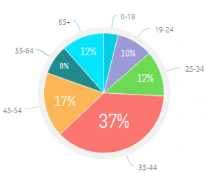
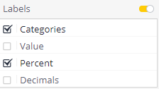
Labels: Select which labels to display on the pie chart, as indicated below:
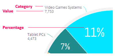
Note: Numbers in Pie charts are rounded up and this may lead to the percentages totalling to 101%.
-
Show ‘Others’ Slice: Toggle this setting to control the display of the ‘Others’ slice:
- Include in the ‘Others’ slice all categories (slices) smaller than X percent (%), OR
- Show X slices, and group all the rest into the ‘Others’ slice
-
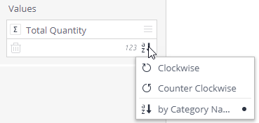
Set the direction of slices: Click the
 Sort button in the Values section in the Data panel to set the direction of slices:
- Clockwise or counterclockwise by category percentages
- By category name (from A to Z, or from 1 and higher)
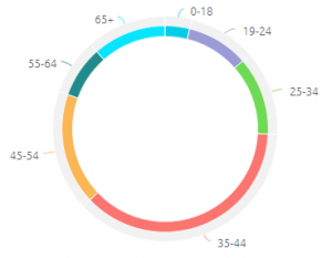
Exploring Pie Charts
You can drill down into pie charts just like other widgets. In addition, when your pie chart has so many smaller slices that they are aggregated into a single slice called Others, you can click this slice to display a second pie chart containing a breakdown of the Others slice.
For example, the pie chart below displays a breakdown of the top 5 slices in a pie chart with many smaller slices included in the Others slice.
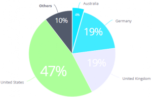
By clicking the Others slice, you can see a breakdown of all the slices included in the Others slice.