The column chart can be used in different business scenarios, especially for comparing items and data over time. The chart can include multiple values on both the X and Y-axis, as well as a break down by categories displayed on the Y-axis.
Adding Data
- In the Categories panel, click Add + to select the field(s) whose values will be placed on the X-Axis.
Typically, the X-Axis of a Column Chart is descriptive data. You must add at least one item to Categories, and at most, two items.
When two Category items are added, then the chart’s X-Axes are automatically grouped. To change the order of the categories, drag a category up or down in the Categories list.
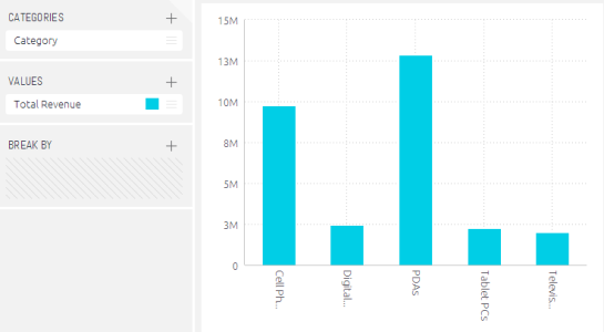
One Category Item
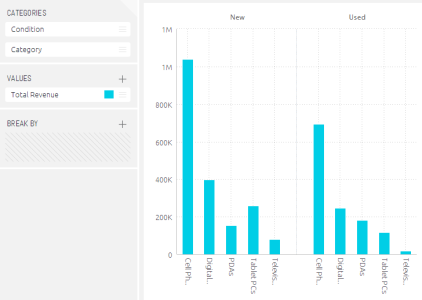
Two Category Items
2. In the Values area, select the field whose value determines the height of the columns by clicking Add +. Typically, the Y‑Axis of a Column Chart is used to represent numeric data.
You must add at least one field to Values. When more than one Value is added, then each item is represented in the chart by its own colour and area.
3. If desired, select a field by which to break (group) the data represented in this chart by clicking Add +.
Each group is represented by a different column and is automatically added to the chart’s legend.
This is an optional field, and operates under the following conditions:
-
- At most one Break by field can be added.
- The Break by option is available only when a single field was added to Values (Y-Axis).
- Only a single field can be added to Values, if the Break by option, described below, was used.
4. Define filters for the widget, as described in Filtering Dashboards.
Designing the Column Chart
Fine-tune the appearance of the column chart Widget, using the following tools:
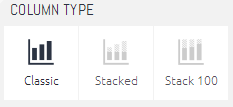
- Column Type: Select how columns are represented in the Widget:
- Classic: Columns are displayed side by side.
- Stacked: Columns are stacked on top of each other and do not overlap. The tooltips over the columns show the percentage distribution among the Values.
- Stacked 100: Columns are stacked on top of each other (but do not overlap) and the combined column is stretched to represent 100%. This option is most commonly used when the relative distribution of the values is more important than their aggregation.
Selecting the Column Type
| Classic | Stacked | Stacked 1000 |
.png?width=280&height=300&name=image(19).png) |
.png?width=285&height=300&name=image(20).png) |
.png?width=274&height=300&name=image(21).png) |
-
Legend: Specify whether to show or hide the Legend and its position.
-
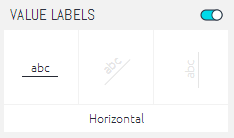
Value Labels: Specify whether to show or hide labels showing values in the Column Chart. You can also select the angle of the labels.
-
X-Axis: Enable or disable the following options:
- Grid Lines: Shows (Default) / hides.
- Labels: Shows (Default) / hides.
- Title: Select the checkbox to display the X-Axis title. To edit the title, type in a new title. Click outside the text box to apply the new value.
-
Y-Axis: Enable or disable the following options:
- Grid Lines: Shows (Default) / hides.
- Logarithmic: Displays using orders of magnitude.
- Labels: Shows (Default) / hides.
- Title: Select the checkbox to display the y-axis title. To edit the title, type in a new title. Click outside the text box to apply the new value.
- Values on Axis: To change the default minimum, maximum or interval values on the axis, type in the new values, and click outside the text boxes to apply the new values. To restore any of the values to their default states, click on the reset button.
-
Auto Zoom: When a widget contains more data than can comfortably be displayed in one view, Auto Zoom will resize the chart to include more data, and in some cases adds a zoom bar under the widget. The zoom bar enables you to scroll right and left and to zoom in/out of different parts of the width of the widget.